Filter stamps
Let's Take the Ferry!

Ferries are part of Canada's marine heritage and continue to play a role in regional transit systems. Harkening back to a more leisurely mode of travel, these stamps, featuring Canadian ferries still in service, are sure to inspire both nostalgia and wanderlust.
Read moreDenys Arcand

Canada Post has a long-standing tradition of commemorating Canadians who have made an indelible mark in the entertainment industry – most recently, such acclaimed actors as Monique Mercure and Christopher Plummer.
Read moreIndigenous Leaders
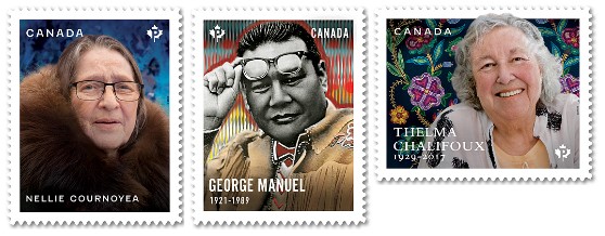
The second set of stamps in the Indigenous Leaders series honours three Métis, First Nations and Inuit leaders whose tireless efforts to protect the rights, culture and welfare of their people had a profound influence on Canada's history.
Read moreRoyal Canadian Mounted Police 150th anniversary

Canada Post is marking the 150th anniversary of the Royal Canadian Mounted Police (RCMP) with a single stamp and Official First Day Cover. Originally a 300-person corps, the RCMP was established as the North-West Mounted Police by an Act of Parliament on May 23, 1873. As the country grew and became more populous, the organization broadened its jurisdictions, evolving into the internationally recognized police organization it is today.
Read moreHis Majesty King Charles III
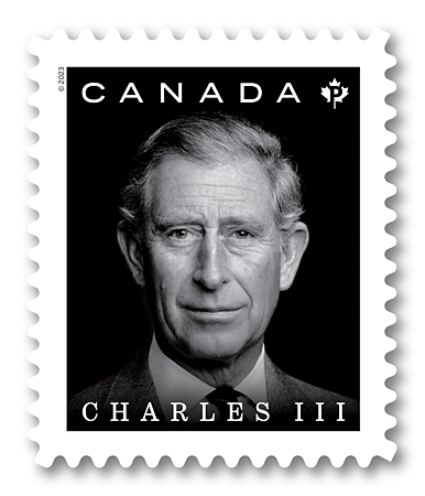
On September 8, 2022, His Majesty King Charles III ascended the throne at the passing of his mother, Queen Elizabeth II. The heir apparent since 1952, The King was invested as Prince of Wales by The Queen when he was nine years old. He was an early advocate for environmental issues and is the president or patron of more than 400 organizations, including many in Canada. Since his first official tour in Canada in 1970, His Majesty has returned numerous times.
Read moreCanada Post Community Foundation

Read all about it! The latest Canada Post Community Foundation semi-postal fundraising stamp issue highlights the importance of literacy and imagination in the lives of children. The stamp is now being released in the spring to accommodate the addition of the annual Truth and Reconciliation stamp issue to the program in September and ensure both stamp issues – and the important stories they tell – get the time, attention and respect they deserve.
Read moreAnimal Mothers and Babies
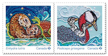
Issued in the lead-up to Earth Day and Mother’s Day, these stamps depicting the tender relationship between two animal mothers and their babies are a perfect marriage of science and art.
Read moreEid

Crafted nearly 700 years ago in medieval Iran, the elegant, hand-painted ceramic bowl on this year’s Eid stamp became part of the Royal Ontario Museum (ROM) collection in 1909. Made during Ramadan – one of the holiest months in the Islamic calendar – it would likely have served many owners over the centuries as a vessel for foods eaten to break the fast each night.
Read moreRanunculus
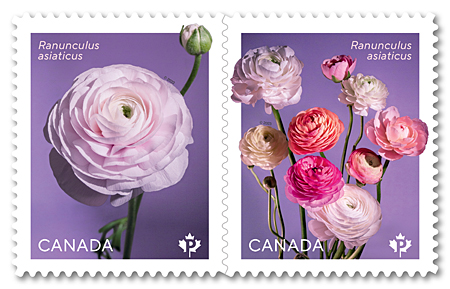
Once again, Canada Post welcomes spring with its annual flower issue. The 2023 stamps feature the lavish, rose-like blossoms of Ranunculus asiaticus, one of the many varieties of ranunculus that are a favourite of florists and gardeners and a popular choice for wedding bouquets, centrepieces and containers.
Read moreChloe Cooley
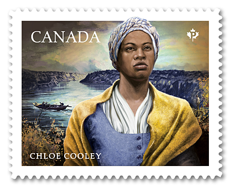
Bringing the story of Chloe Cooley to life was both a challenge and an honour, say the experts who worked with Canada Post to create this powerful Black History Month issue. A young, enslaved woman, Cooley fought for her life as she was forced from her owner’s homestead near Queenston, Upper Canada, and ferried across the Niagara River to be sold in New York State.
Read moreMonique Mercure

Known for her fiery spirit and intensely powerful performances, Monique Mercure, C.C. (1930-2020), was one of Canada’s most admired and acclaimed francophone actresses. The stamp illustration, based on a photo from the early days of her career, captures the magnetism of Quebec’s grande dame of stage and screen and her arrestingly expressive eyes.
Read moreHanukkah
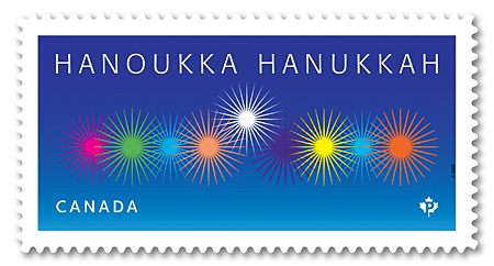
A fresh take on an age-old tradition, this new Hanukkah stamp conveys the joyful spirit of the Jewish Festival of Lights through a fun, flamboyant interpretation of the flames on a hanukkiyah (a special eight-branched menorah). This year, the celebration takes place from nightfall December 18 to nightfall December 26.
Read moreHoliday Birds
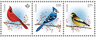
As we move into winter, we count on the cheerful colours of the holidays to bring light into the darkness. In this year’s holiday issue, with stamps in three denominations, you’ll find three birds that remain with us through the long winter months. Their brilliant colours and visits to backyard feeders brighten the season, and like other birds and animals, they can bring us meaningful messages, which vary by culture or tradition.
Read moreChristmas Star
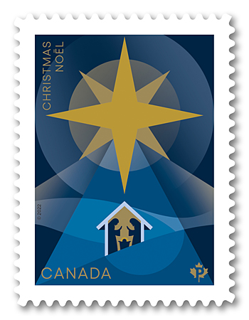
One of the most ubiquitous symbols of the Christmas season is the star, inspired by the bright body in the heavens that led the Magi to the infant Jesus. According to the Gospel of Matthew, chapter 2, verse 9, “After they had heard the king, they went on their way, and the star they had seen when it rose went ahead of them until it stopped over the place where the child was.”
Read moreTommy Prince, 1915-1977
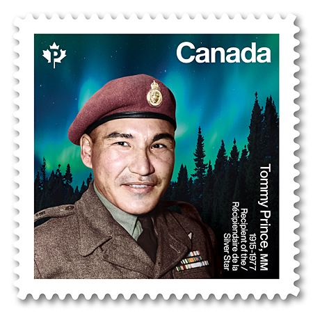
Born on St. Peter’s Reserve, Manitoba, into the Brokenhead Ojibway Nation, Sergeant Thomas (Tommy) George Prince, MM (1915-77), was one of Canada’s most decorated Indigenous non-commissioned officers and war veterans, and a prominent Anishinaabe activist.
Read moreCanadians in Flight
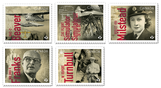
Ready for take-off on its return trip, the second edition of Canadians in Flight once again celebrates the people, planes and technologies that have allowed Canada’s reputation for innovation to soar. Since the early days of flight, Canadians have made global advances in the fields of aviation and aeronautics, with some contributions remaining the foundation for ongoing advancement in these fields.
Read moreDiwali
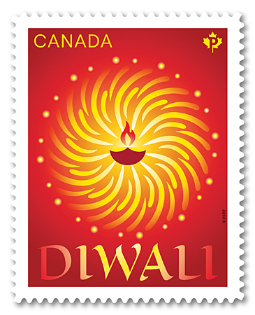
Two luminous traditions central to the celebration of the triumph of light over darkness are artfully married in the design of this year’s stamp marking the arrival of Diwali. An important holiday observed by many Hindus, Buddhists, Jains, Sikhs and others, the festival takes place this year on October 24.
Read moreTruth and Reconciliation
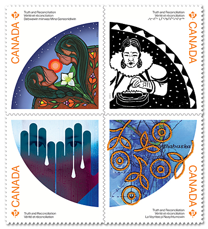
Released on the day prior to September 30, the National Day for Truth and Reconciliation, this stamp issue is the first in a series showcasing the visions of Inuit, Métis and First Nations artists for the future of truth and reconciliation, with the hope of encouraging awareness of and reflection on the effects of colonization on Indigenous Peoples and the work of the truth and reconciliation process.
Read moreCanada Post Community Foundation
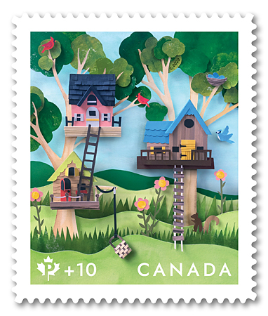
Once again, Canada Post invites Canadians to contribute to programs for children and youth through this year’s 11th Canada Post Community Foundation semi-postal fundraising stamp.
Read moreThe Summit Series, 1972

Where were you on Thursday, September 28, 1972? If like many Canadians, you were glued to a television or radio in your home, office or school – and lent your voice to a cheer that reverberated around the country when Team Canada defeated the Soviet national hockey team in Game 8 of the famed hockey series, breaking the tie score in the final moments of the third period.
Read moreHelp for Ukraine
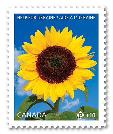
Recognizing the generosity of Canadians in times of need, Canada Post has issued a semi-postal fundraising stamp to offer our customers and collectors an opportunity to support those impacted by the Russian invasion of Ukraine. Funds raised through the purchase of this stamp will be distributed through the Canada-Ukraine Foundation.
Read moreVintage Carousels
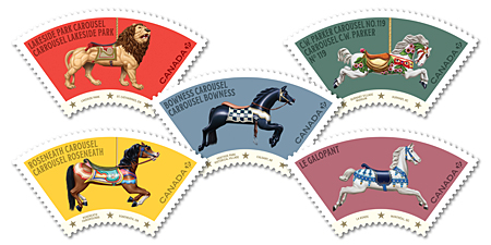
Can you smell the cotton candy? Do you hear the barkers in the midway daring you to test your game skills? This five-stamp issue featuring vintage carousels from across Canada is designed to bring you back to the summer fun of your youth.
Read moreIndigenous Leaders
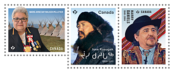
Proud advocates for the rights and well-being of their people, the three modern-day Indigenous leaders in this inaugural series are honoured for dedicating their lives to preserving Métis, First Nations and Inuit culture and improving the quality of life of Indigenous Peoples in Canada.
Read moreVintage Travel Posters
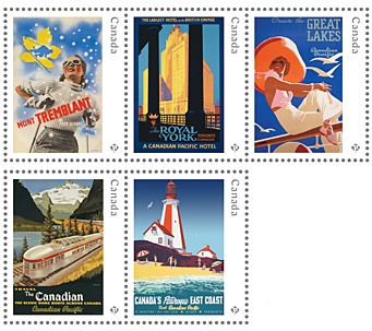
Eye-catching and elegant, travel posters produced by companies such as the Canadian Pacific Railway beckoned visitors to explore Canada’s wild beauty and urban attractions in the early 20th century. The five featured on these stamps recall what was a golden age of commercial art in this country.
Read moreEndangered Whales
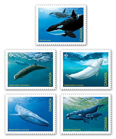
Canadian waters are home to more than half of the approximately 60 species of whales found in the world. Unfortunately, the five featured on these stamps have populations that have been assessed as Endangered by the Committee on the Status of Endangered Wildlife in Canada (COSEWIC). Seven other species are also at risk.
Read moreSalome Bey
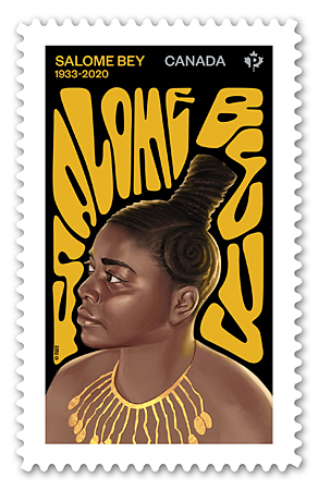
This stamp celebrates the life and work of Salome Bey, known as Canada’s First Lady of the Blues, who provided inspiration and mentoring for young Black performers.
Read moreEid
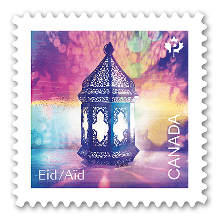
A copper lantern embellished with intricately pierced designs casts patterns of dappled, multi-coloured light on this new stamp celebrating two of Islam’s most important religious holidays: Eid al-Fitr (Festival of Fast Breaking) and Eid al-Adha (Festival of Sacrifice).
Read moreOrgan and Tissue Donation
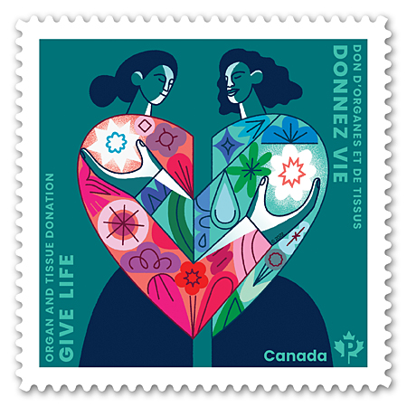
On April 6, 2018, Canadians across the country were horrified to learn of the Humboldt Broncos hockey team bus crash in Saskatchewan that ended the lives of 16 people and injured 13 others. Defenceman Logan Boulet succumbed to his injuries the following day. Knowing their son had registered as an organ donor, his parents donated his organs, which saved six lives. Logan had been inspired by his coach and mentor Ric Suggitt, who passed away in mid-2017 and also saved six lives as a donor.
Read moreCalla
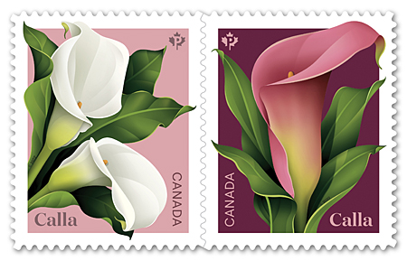
Most of us refer to the graceful trumpet-shaped flowers that often adorn weddings and other occasions as calla lilies. But it seems we've been wrong all along! The calla (Zantedeschia) – native to the southern parts of Africa – isn't a lily at all. It's a member of the unusual arum family (Araceae), which includes peace lily, skunk cabbage and jack-in-the-pulpit.
Read morePlatinum Jubilee of Her Majesty Queen Elizabeth II
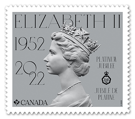
This year marks Her Majesty Queen Elizabeth II’s 70th anniversary as sovereign – and platinum jubilee celebrations will be held in Commonwealth countries around the globe. On February 6, 1952, the then-princess was just 25 years old, and the mother of two young children with her naval husband, The Duke of Edinburgh, when she ascended the throne on the death of her father, King George VI. Queen Elizabeth II is Canada's longest reigning sovereign, a distinction she achieved in September 2015.
Read moreEleanor Collins

Canada’s first lady of jazz, Eleanor Collins, C.M., has led a storied life. Still vibrant at 102, the Vancouver-based singer broke new ground in her genre and quietly confronted racial prejudice through her community service.
Read moreMargaret Atwood

Margaret Atwood is one of the most successful and admired writers Canada has ever produced.
Read moreHanukkah
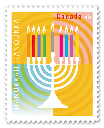
A joyful celebration of faith and tenacity, Hanukkah – also known as the Festival of Lights – takes place this year from nightfall November 28 to nightfall December 6.
Read moreHoliday Characters
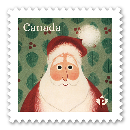
Every holiday season since 1964, Canada Post has issued festive stamps to make sending cards and letters to friends and family more fun. This year, we’re inviting you to dress up your mail with some familiar holiday faces.
Read moreChristmas: Angels
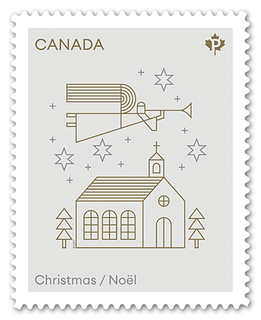
This year’s heavenly Christmas issue is inspired by the angels who played an essential role as messengers in the Nativity story. Designed by Stéphane Huot and illustrated by Luc Melanson, the simple line drawings in gold and silver on a crisp white background call up a sense of purity and peace. The Permanent™ domestic rate stamp is available in a booklet of 12. An Official First Day Cover is cancelled in Christmas Island, Nova Scotia.
Read moreThe Remembrance Poppy
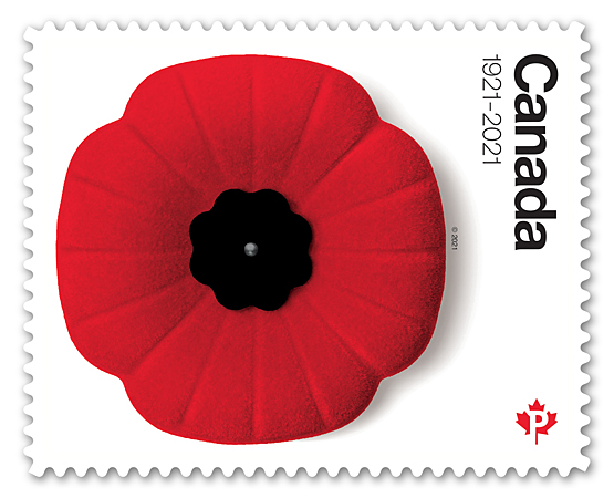
Celebrating its 100th anniversary as a symbol of remembrance in Canada, the bright red poppy that once thrived on the battlefields of Europe has become one of our most evocative and enduring emblems.
Read moreValour Road
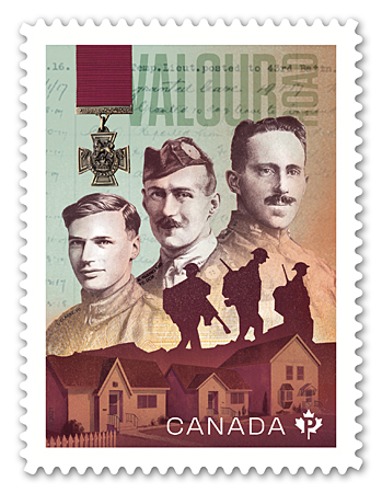
A stamp to honour three Winnipeg residents whose courage in the First World War was recognized with a Victoria Cross, which inspired the renaming of Pine Street they once called home.
Read more“A” and “B” Batteries, 1st Regiment, Royal Canadian Horse Artillery
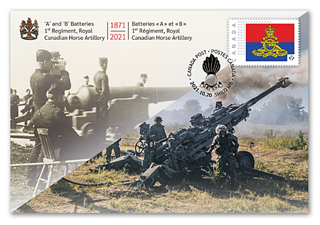
This commemorative envelope marks 150 years since the establishment of the first full-time or regular elements of the post-Confederation Canadian army.
Read moreDiwali

Layers of symbolism are woven into the eye-catching Rangoli pattern on this stamp heralding the arrival of Diwali on November 4. A time to reflect, overcome negativity, and spread light and love, the five-day festival is observed by Hindus, Buddhists, Jains, Sikhs and others around the world.
Read moreChristopher Plummer, 1929‑2021
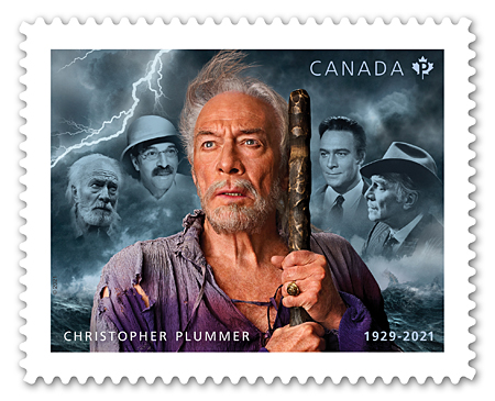
This issue pays homage to Toronto-born Christopher Plummer, one of the world’s most distinguished actors, featuring him in some of his most celebrated roles.
Read moreEditorial Cartoonists
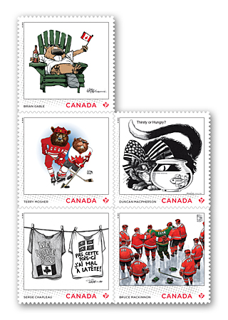
With this stamp issue, Canada Post features the work of five homegrown editorial cartoonists – all members of the Order of Canada and multiple winners of industry awards.
Read moreCanada Post Community Foundation
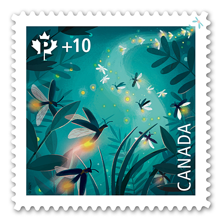
Following the success of the Canada Post Community Foundation's 2020 stamp, this year's design was also selected by Canada Post frontline employees who are well versed in what appeals to their stamp-buying customers.
Read moreStan Rogers, 1949-1983

When Stan Rogers took the stage, guitar in hand, his presence was electric. Standing six foot four, with a deep, rumbling voice that rose and fell like waves on a Nova Scotia shore, he poured his heart and soul into every word he sang. Poetry set to music, his ballads laid bare the lives of the sailors, ranchers, miners and others whose stories had captured his imagination.
Read moreBluenose, 1921-2021
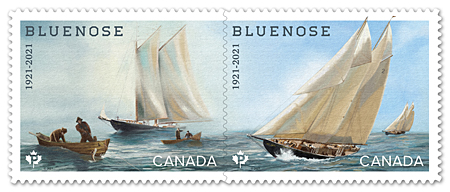
This year marks the 100th anniversary of the launch of Bluenose, the most recognized sailing vessel in Canadian history. The famous schooner was designed and built in response to a rivalry between Lunenburg, Nova Scotia, and Gloucester, Massachusetts, over which community produced the fastest and most successful fishing vessels.
Read moreJohn Turner, 1929-2020

Remembered by mourners at his state funeral for his integrity, humility and grace, the Right Honourable John Napier Wyndham Turner (1929-2020) – Canada’s 17th prime minister – dedicated much of his life to public service.
Read moreCanadian Ballet Legends
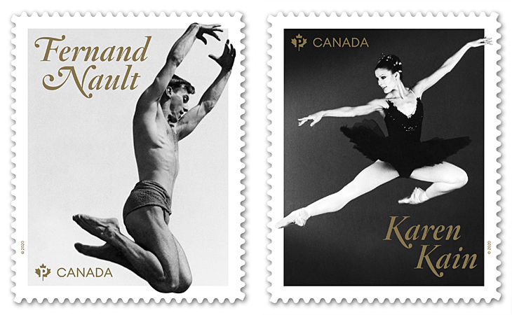
The pair of stamp designs, featured in separate booklets of six and a souvenir sheet, capture each dancer in characteristic movement, indramatic black and white photography, with classic metal gold accents. Two Official First Day Covers, one for each of the legends, are cancelled in theirrespective birthplaces.
Read more12e Régiment blindé du Canada 150th Anniversary
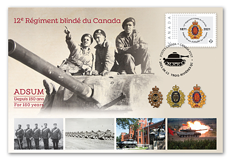
Founded as a provisional battalion of infantry in 1871, the 12e Régiment blindé du Canada had soldiers deployed in the First World War and earned numerous battle honours during the Second World War as an armoured unit.
Read moreInsulin, 1921-2021

The centennial of one of Canada’s most important medical discoveries is celebrated for the life-changing impact it has had on people with diabetes around the world.
Read moreEid
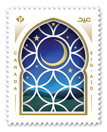
The third stamp in our ongoing series honouring the Islamic festivals of Eid al-Fitr and Eid al-Adha sees the light (of the moon).
Read moreJUNO Awards 50th Anniversary
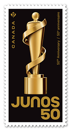
This stamp, showcasing a special anniversary statuette, marks 50 years of honouring the best in Canadian music.
Read moreSnow Mammals
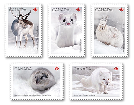
Life in the wild can be a deadly game of hide and seek, where blending in with the landscape is critical to survival. These stamps – issued in the depths of our Canadian winter – showcase five native mammals that share the remarkable characteristic of changing colour with the seasons.
Read moreCrabapple Blossoms
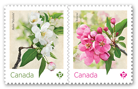
The sweet fragrance of a crabapple tree in bloom is one of the most pleasant reminders that spring is, quite literally, in the air. The blossoms depicted on this year’s flower stamp issue pay tribute to two Canadian-bred varieties.
Read moreConcordia University of Edmonton, 100th Anniversary

Located in the heart of Alberta’s capital city, Concordia University of Edmonton has evolved since its founding in 1921 into one of Canada’s pre-eminent small universities, known for its diversity and academic excellence.
Read moreBlack History: Willow Grove, NB, and Amber Valley, AB
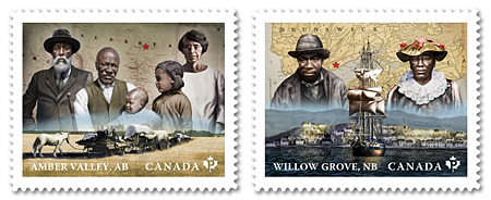
Settlers faced immense challenges forging a new life in the rugged Canadian wilderness.
Read moreLunar New Year Cycle
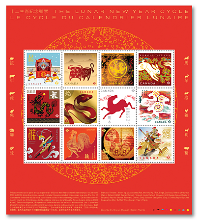
The culmination of more than a decade of award-winning stamps, this retrospective brings together in a single issue all the stamps from our most recent Lunar New Year series.
Read moreHanukkah
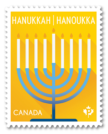
This brilliant new stamp issue shines a light on Hanukkah, the eight-day Festival of Lights, which this year begins at nightfall on December 10.
Read moreChristmas: Nativity
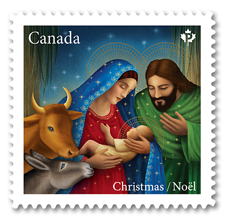
Our latest Christmas issue is a heartwarming celebration of the Nativity designed by Toronto-based Soapbox Design and illustrated by Sandra Dionisi.
Read moreHoliday: Maud Lewis

The folk art paintings of Maud Lewis (1901-70) are a colourful and joyful portrayal of country life in the Maritimes.
Read moreDiwali
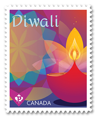
This brilliantly coloured annual issue marks the Festival of Lights celebrated by Hindus, Sikhs, Jains, Buddhists and other communities in Canada and around the world.
Read moreMary Riter Hamilton
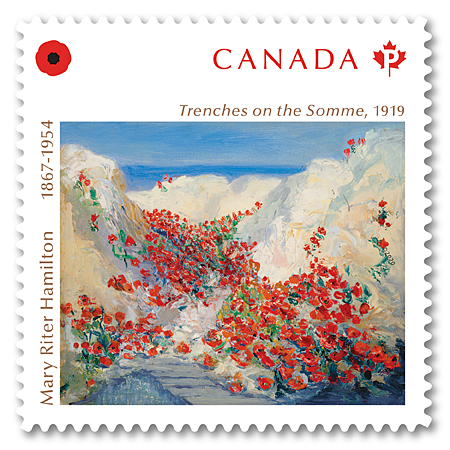
Issued to mark Remembrance Day, this stamp reproduces Trenches on the Somme (1919) by Mary Riter Hamilton, Canada’s first unofficial woman battlefield artist.
Read moreMedical Groundbreakers

Six innovative medical physicians and researchers whose significant discoveries changed lives in Canada and around the world are honoured in this five-stamp issue.
Read moreCanada Post Community Foundation
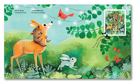
Our annual fundraising stamp for the Canada Post Community Foundation – with a design chosen by our frontline employees – reminds us that being a community is about living together in harmony.
Read moreGroup of Seven 1920-2020
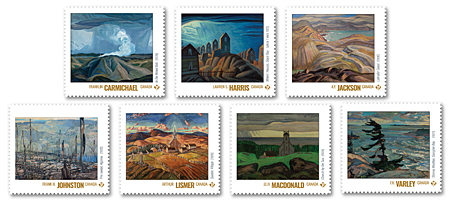
A seven-stamp issue celebrates the 100th anniversary of the Group of Seven’s first exhibition.
Read moreHistory of Radio in Canada

This issue marks the pivotal moment, a century ago, when Montréal station XWA made the first radio broadcast in Canada.
Read moreEid
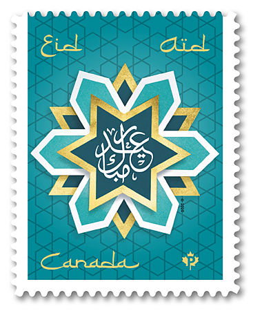
With the Eid stamp issue, we join the more than one million Muslims in Canada as they celebrate two of the most important festivals in the Islamic calendar.
Read moreVictory in Europe 1945-2020
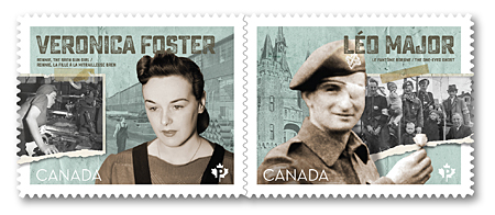
We mark the 75th anniversary of the end of the war in Europe with two stamps that tell the stories of Canadian courage and patriotism – on the battlefield and at home.
Read moreBlack History: Colored Hockey Championship
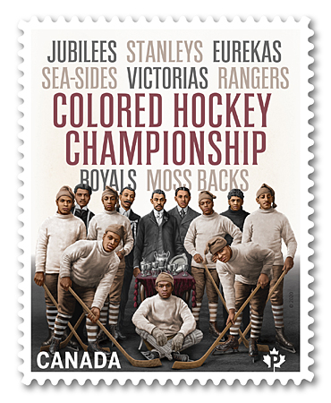
This year, we recognize the history of Black Canadian hockey teams, based in the Maritimes, that challenged each other to matches and the ultimate prize – the Colored Hockey Championship.
Read moreDahlia
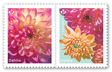
Our annual flower issue – perfect for the wedding season – signals the coming of spring with a pair of stamps in full bloom.
Read moreYear of the Rat
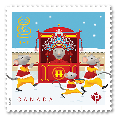
The final stamp in our Lunar New Year series celebrates the optimistic, intelligent and congenial people born in the Year of the Rat.
Read moreFrom Far and Wide
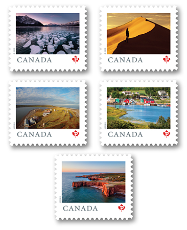
The third instalment of this far-reaching definitive stamp issue features nine more locations that show the beauty of our country.
Read more

